UX case study
Designing a controlled AI material-swap workflow for production teams
A prototype for Enabl Studio that turns repetitive packshot material changes into a workflow: upload one product, choose a material, generate variants, and review the results in one place.
Year
2026
My role
UX Research, User Interviews, User Testing, End-to-End Prototype
Scope
AI workflow design, interaction design, prompt-to-control translation
Story
From client request to workflow
A client of Enabl's sister production company needed many different packshot images for their website. Internally that meant making the same kind of image over and over again: one product, many fabrics, many colorways.
That made it a good candidate for a workflow. Instead of treating every material swap as a separate prompt experiment, I wanted to make it feel like a repeatable production task: choose the packshot, choose the material, keep the product stable, and review the generated outputs.
Learning from the 3D team
I sit close to the 3D team, so the first step was not to start from a blank canvas. I asked them what they had found while trying the workflow manually: what worked, what broke, which prompts helped, and where the results became hard to trust.
Turning it into user stories
I combined those findings into a few user stories and then moved into wireframes. We tested a couple of possible workspace patterns together and landed on a structure that felt easy to explain: product library on the left, material library on the right, and the active comparison and generation controls in the middle.
Process chapters
The process as one guided sequence
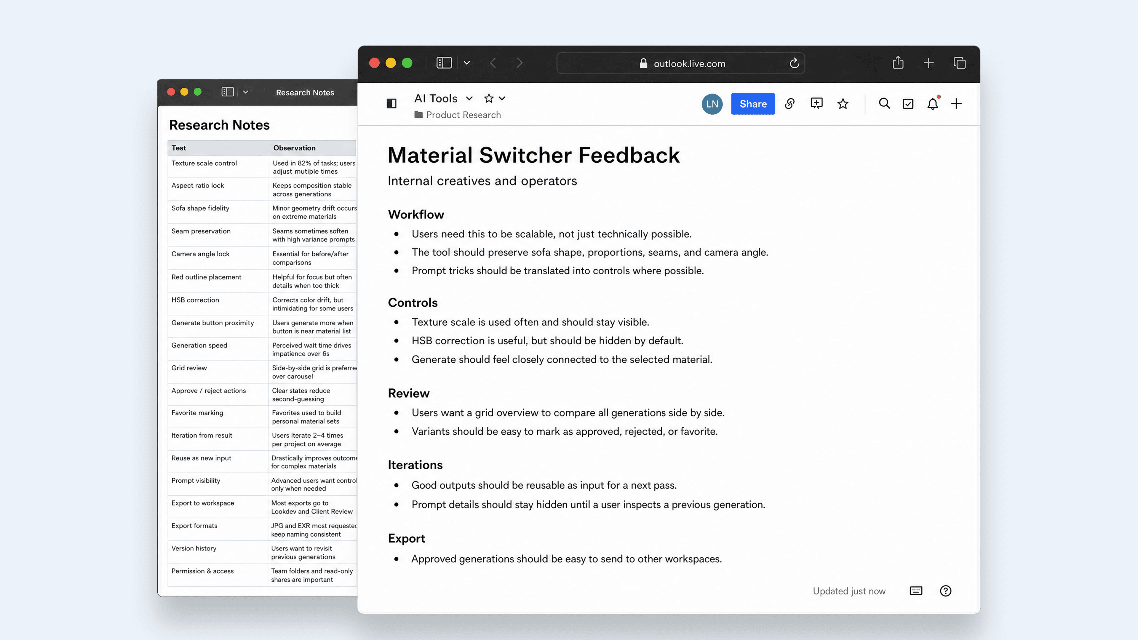
Findings
The main things the workflow needed to solve
Finding 01
The product shape had to stay fixed
The 3D team found that the material swap worked best when the input and output stayed in the same ratio. If the crop changed, the model could slightly stretch the sofa or shift the camera.
UX decision: I removed ratio choice from the main flow and let the product upload determine the safest output ratio.
Finding 02
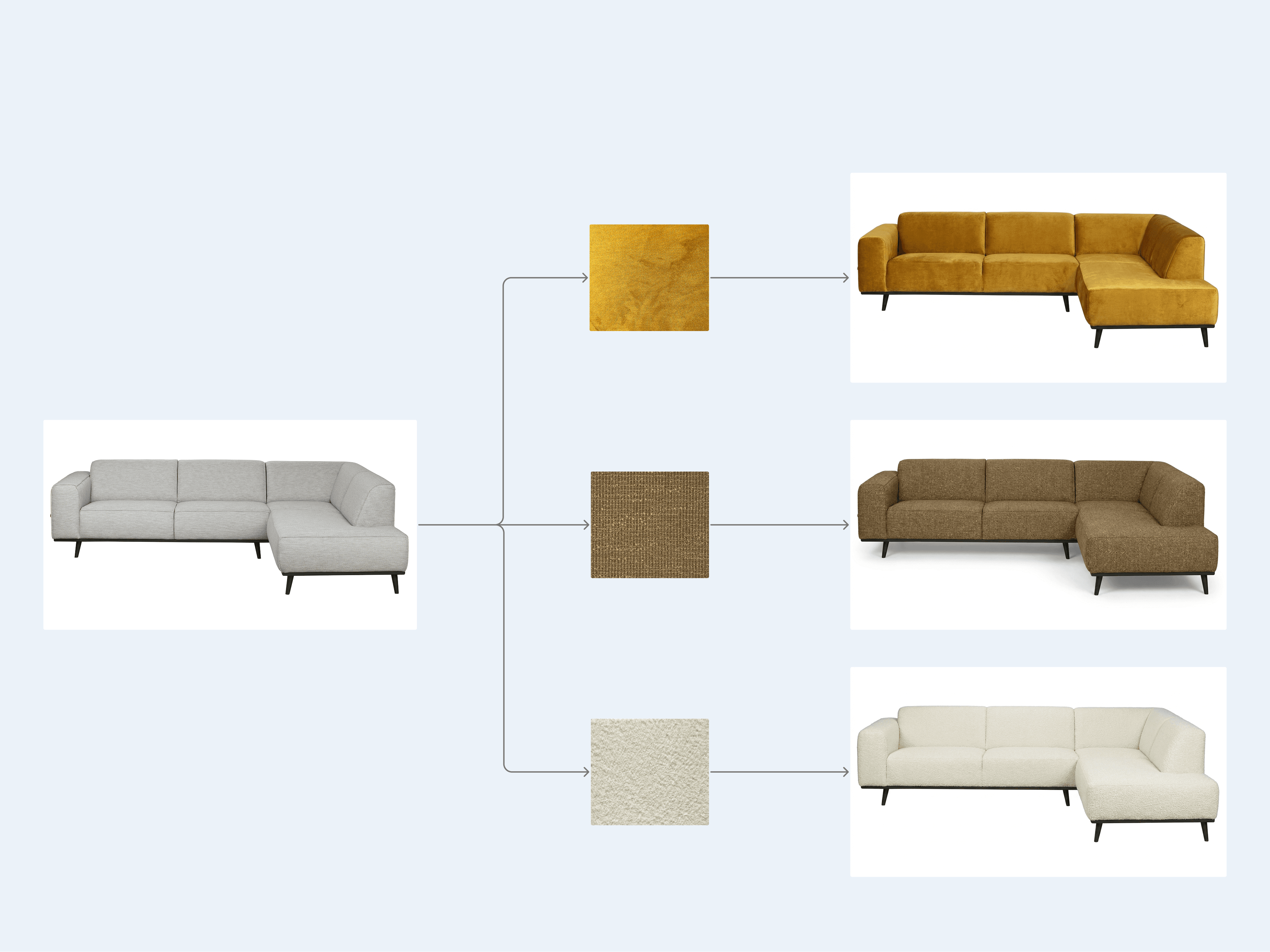
Pattern scale was controlled through prompt wording
Changing the size of the uploaded fabric did not reliably change the scale on the sofa. The model reacted more to wording like extremely small or very large.
UX decision: I turned those repeated prompt phrases into a small scale dropdown.
Finding 03
The fabric scan sometimes needed a small correction
Even when the scan looked usable, the result could come out too bright, too dark, or slightly off in saturation. That meant extra cleanup after generation.
UX decision: I added a restrained HSB correction step before generation, with a live material preview.
Finding 04
Reviewing many variants needed its own mode
The split view was useful for checking one result closely, but not for judging a whole batch. Once there were many variants, people needed to scan them together.
UX decision: I kept the filmstrip for focused comparison and added a grid view for quick triage.
Finding 05
The workspace needed a simple mental model
During wireframing we kept coming back to the same structure: products are stable, materials are stable, and the actual work happens in the middle.
UX decision: Products stayed on the left, materials on the right, and the active generation settings moved into one command bar.
Workflow architecture
A simple workspace model
The interface ended up with one simple rule: stable sources on the sides, active work in the middle. The product stays on the left because every output belongs back to that packshot. Materials stay on the right because they are reusable references.
The center is where the operator makes and judges the image: compare the result, scan the filmstrip, adjust the command bar, and generate again. That made the workspace easier to explain to the team without turning every part into its own section.

Component system
The main parts of the prototype
These are the core parts of the workflow. I kept the case study focused on the actual states that matter: source selection, generation intent, variant history, and review.
Product vault
Fixed left source panel. Products are the parent object; every generated version is scoped back to the active product.

Material palette
Fixed right source panel with selection, search, grid/list states, upload, and material edit/delete menus.

Comparator
The center inspection surface lets the team compare the original packshot against a generated material version with a draggable split line.

Command bar
The bottom cockpit combines active material, optional source generation, scale, model, prompt notes, visual correction, and generate action.

Filmstrip
A product-specific generation history, grouped by material, with drill-down for multiple versions of the same fabric.

QA grid
The overview mode turns generated versions into review items with approve, reject, reset, delete, and bulk-selection actions.

Design translation
Turning fragile prompt knowledge into interface logic
The important design decision was deciding what should become a visible control and what should just happen in the background. The team should be able to guide the result, but they should not have to remember the same prompt tricks every time.
Research signal
Geometry must feel sacred
Prototype response
The upload flow reads the product ratio and keeps that choice out of the day-to-day controls.
Research signal
Scale should not be retyped in every prompt
Prototype response
The scale dropdown stores the useful wording from testing and applies it consistently.
Research signal
Small color fixes should happen before generation
Prototype response
The HSB correction updates the swatch preview and sends the corrected material reference to the model.
Research signal
Variants need to stay tied to their material
Prototype response
The filmstrip groups results by material, so one fabric can have multiple versions without turning into a flat mess.
Research signal
The generate action needs context
Prototype response
The command bar shows the active material, scale, model, prompt note, and generate button in one place.
Research signal
A/B compare is not enough for scoring
Prototype response
The grid view lets the team approve, reject, reset, delete, and bulk-select outputs.
System rules
Some things became controls, other things became defaults
I did not want to expose every technical detail as a setting. Some things are important for the operator to choose. Other things should become sensible defaults because they protect the quality of the output.
Hidden constraints
The system handles things that should not become operator work: aspect ratio mapping, geometry-preservation wording, and model-specific scale instructions.
Visible intent
The user still sees the choices that matter creatively: material, scale, model, source image, prompt note, and how many generations will run.
Non-destructive review
Every generated version keeps its material and settings context, so the team can compare, reuse, approve, reject, or delete without losing track.
Outcome
From prototype to production direction
The prototype was useful because it revealed where the workflow still broke down. It gave the team something concrete to test against: not just whether the AI could change a material, but whether users could control, compare, iterate, and export results in a way that fit production work.
The findings shaped the production version directly. Repeated prompt tricks became interface controls. Common failure points became defaults or guardrails. Review and export became part of the workflow instead of an afterthought.
What the prototype proved
The team did not need a generic image generator with a blank prompt box. They needed a structured material-switching workspace: one that preserved the product, kept material decisions visible, supported iteration, and made batch review manageable.
What moved into production
The next step was not to keep polishing the prototype. It was to take the validated patterns and unresolved shortcomings into the production build: persistent sessions, background queues, saved material settings, generation/iteration history, grid review, and export for approved results.
Next case